The Wilderness - Case Study
Early Production
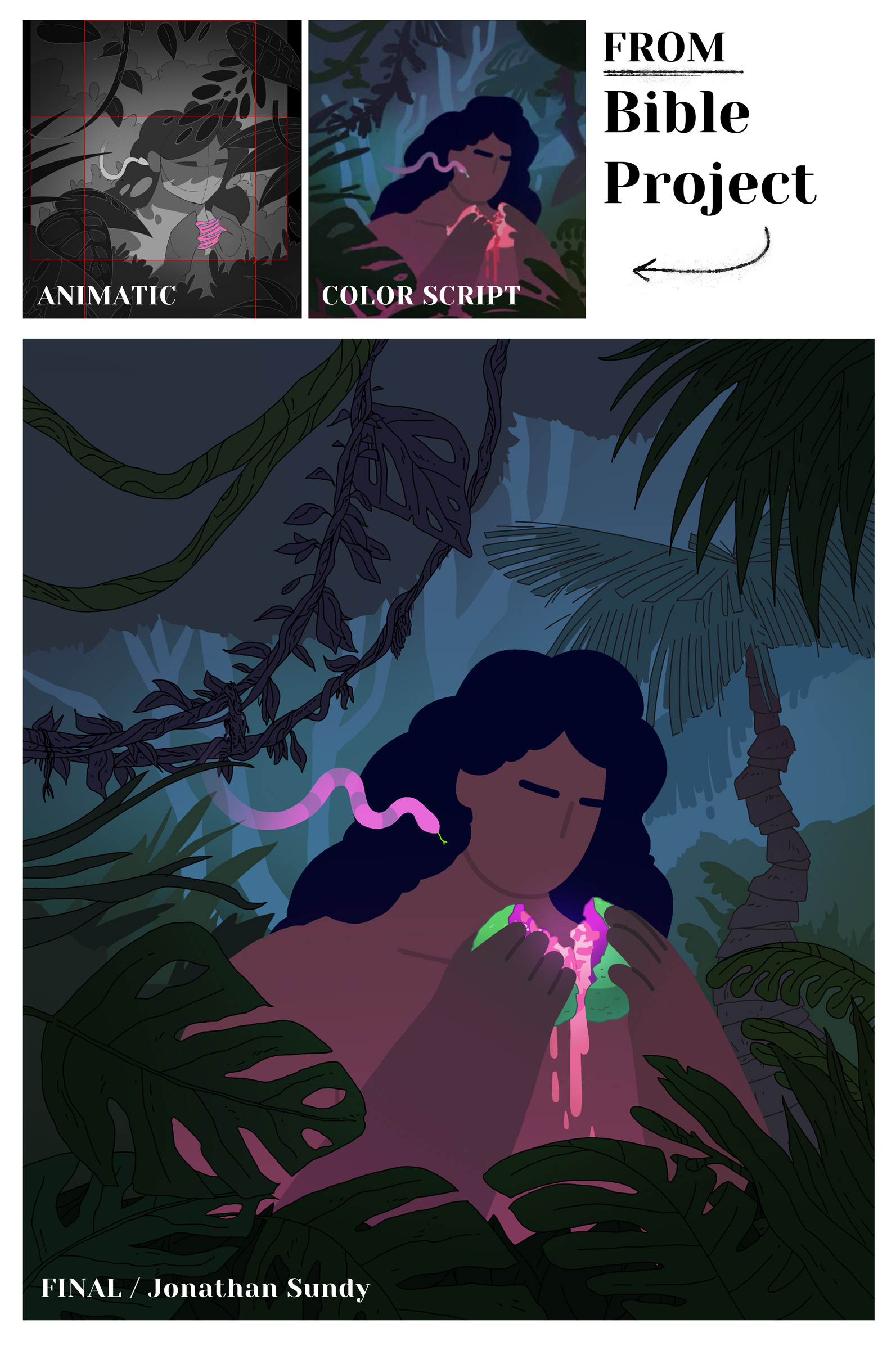
Our collaboration with Bible Project began in mid-2024 to create a major theme video. After many discussions about scope and style with them, we received a comprehensive style guide and starter materials.
The Bible Project’s Guide:
- Animatic
- Color Script
- Lead Character Turn-Arounds
- Character Designs
- Prop Designs
- Motion Tests
- Background and Foliage Concepts
Production commenced with artist Jonathan Sundy creating art based on the guide. I did 1 or 2 rounds of internal review to make sure it was hitting my understanding of the expectation for the shot, and then we passed it along to Bible Project. After their approval we took the shot into animation. Jonathon did an such an amazing job!
Animation
Our biggest concern, provoking the most conversation, was the consistency of the line work and how best to maintain that from shot to shot, but especially if the camera was going to move (dolly) through a scene and ‘fly’ close to the art. It was imperative that the size of the stroke stay the same (or close enough to not be distracting) no matter what happens on screen. This took a ton of planning and testing. We looked through all of the shots, carefully deciding how to approach the line work.
I ended up finding a setting in Illustrator’s much maligned (for good reason) auto-trace tool where I could bring in just the (Photoshop) line work from a shot and auto-trace it and get it to output actual paths with strokes, not the blobby filled shapes it usually produces. Then I could apply an expression on that stroke once it was in After Effects that maintained its width regardless of how big it was in the shot.
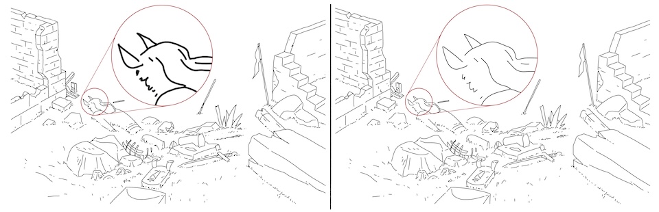
On the left: you can see how when scaled, the line work in Photoshop gets blurry and thicker. On the right: an example of how converting some selective line art layers to vector in Illustrator results in the line work maintaining its sharpness and width.
This auto-trace technique also came in handy in creating animatable assets - like this flag.
WideScreen & Vertical Video
A lot of times in video production you have to create different versions of your video for both a wide screen (tv/computer) or vertical (phone, social media stories). This can be a painful process unless you have a really good plan in place on how you’re going to resize the art and animation. Bible Project worked this out by framing each shot in the animatic as a square, with 2 rectangles showing how to crop both horizontal and vertical at the same time. Our artist used these cues and created all the art in (largely) big squares with similar horizontal/vertical framing guides.
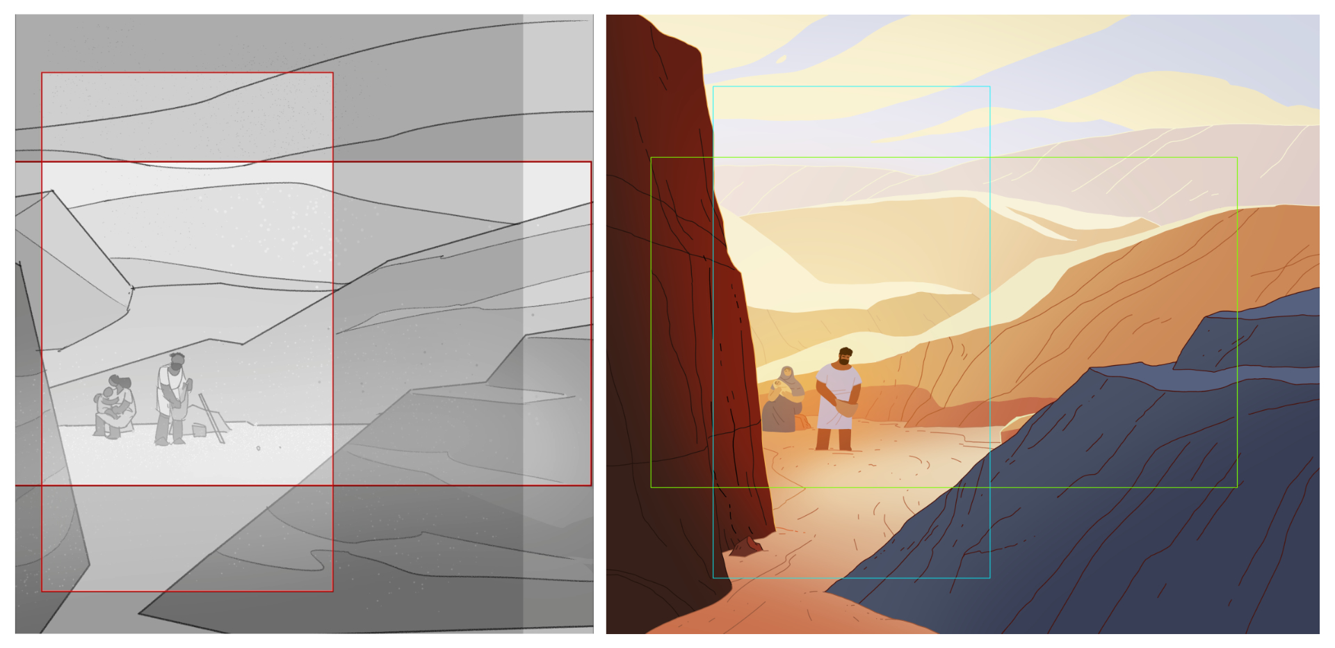
Left: Shot 20 in the Animatic. Right: the same shot framed in the final Photoshop file.
This approach extended all the way to animation and we animated each shot in a square comp as well. These were later brought into wide and vertical comps in After Effects that would crop the square down appropriately. Again its hard to overstate how having really smart professionals involved at every stage of something like this was so important. This is the kind of process stuff that can totally derail a production, and in our case it went super smoothly.
If you compare this closely to the crop marks in the final art you can see we adjusted the cropping a bit when it came time to render.
Different Approaches
Hand-drawn - Rigged - Or something in-between?
Nearly all of the character animation was done in After Effects, using its vector shape layers and a mixture of rigging and raw shape keyframing.
Some of the character acting moments needed more pose planning than others, so we brought on another animator Arley to help with those shots. He did a great job making roughs for those shots in Animate that I was able to clean up in AE.
It’s Blender Time!
I’ve been learning Blender, and I finally felt comfortable enough with it to use it a real production. It came in handy for planning shots with complex camera timing and movement, and I was even able to rig up and animate a character Skitter the Scorpion!
I modeled a tube shape that matched the art for the dead man’s arm and gave it a green color that was easy to key out.
Hear me out
We didn’t shake up the usual production pipeline too much on this one, but one thing I wanted to mention that I felt really helped in the long run was having a dedicated folder in Dropbox that only had the most recent render of every shot in it. We also decided to overwrite these files as we went so the names never changed. I know some of you might be sweating reading this, but hear me out! (ha). I never rendered straight to this folder - I did all renders to the desktop (in a folder called _Dailies I use for everything I render that day), then once I had something ready to go into the edit I moved it over and overwrote the old version in this final ‘SHOTS’ folder.
I’ve wanted to work this way for a while, as keeping track of which file is the actual final version thats ready to ship is usually a nightmare with insane file names + version numbers and such. There were no version numbers in this folder. If it was in there, it was ready to ship, and it kept the assembly edit clean and simple.
(If a file gets overwritten and I need to get back the old version I can roll it back using Dropbox’s file history feature. I think I had to do something like that once during the course of the project… maybe.)
Conclusion
Man, this one was really rewarding, challenging and fun! I’m grateful for the opportunity and for such friendly, smart and talented people to collaborate with. Cheers to all the folks I worked with at Bible Project, namely Patrick Ramos, Nyssa Oru, Robert Perez, Patrick Murphy and Jonathan Rooney. Top notch pros and good people all of ’em.
Also a hearty thanks and a hug to my pals Keith Fenter, Jonathan Sundy and Arley Cornell for their essential contributions to the project.
Thanks for reading.
V
I pinned up the color script and a couple character turn-arounds for constant reference.